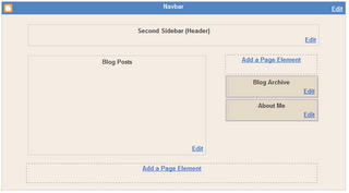
In one of my older posts, I gave a short tutorial on how to add a second sidebar to your Blog. Recently I got some comments of people who got stuck, so I decided to post a second, more detailed tutorial on how to rig up a second sidebar. First, we will add the sidebar to the structure of the template, then we will add it to the CSS, and make it fit into the page.
Understanding structure and layout.
First of all, you have to understand that your Blog Layout consists of several sections. The standard Blogger template has a Header-section, a Sidebar-section, a Main-section and a Footer-section. Inside these section Blogger puts the widgets, these are the page-elements that you can select from the Template-tab.
Now, let's take a look at the structure of a standard Blog. If you create a fresh, new Blog, the Page Elements Tab looks like this:
This Layout has 4 sections: Header, Main (with the Blog Posts), Sidebar and Footer.
The HTML-template looks like this (the line-numbers are added for reference only):
010:
020:
030:
040:
080:
090:
100:
110:
120:
130:
140:
150:
160:
170:
180:
190:
250:
260:
270:
280:
310:
320:
Lines 010 and 320 are the body-tags. All your code has to be between these two tags.
Lines 020 and 310 are the div-tags for two wrappers, the wrapper called "outer-wrapper" and the wrapper called "wrap2". In CSS you can define fonts, colors, and other styling for these wrappers. We'll look into CSS later in this tutorial.
Lines 080 to 120 contain the header. As you see, there is a div-wrapper (080 and 120), section-tags (090 and 110) and the widget that contains the header itself (100).
Lines 130 to 270 contain the content. Content means here: blog posts and sidebar. There is a div-wrapper called "content-wrapper" (130 and 270), and inside this wrapper there are 2 more wrappers: the "main-wrapper" (140-180) and the "sidebar-wrapper" (190-240).
Inside the main-wrapper we find the main-section (150 and 170) with the Blog-widget (160). This widget contains your posts.
Inside the sidebar-wrapper we find the sidebar-section (200 and 230) with an Archive-widget (210) and a Profile-widget (220).
And finally we have a Footer (280-300).
Now that we understand the structure, let's take a look at the formatting of this template. In the stylesheet you will fund the following code:
#outer-wrapper {
width: 660px;
padding: 10px;
....... }
#main-wrapper {
width: 410px;
float: left;
....... }
#sidebar-wrapper {
width: 220px;
float: right;
........ }
The outer-wrapper has a width of 660 pixels. The padding is set to 10 pixels, so that everything that is inside the outer-wrapper stays 10 pixels from the border. So that leaves 660 - 20 = 640 pixels for main-wrapper and sidebar-wrapper.
The main-wrapper has a width of 410 pixels, and floats to the left.
The sidebar-wrapper had a width of 220 pixels, and floats to the right. Together, main-wrapper and sidebar-wrapper have a width of 410 + 220 = 630 pixels. In the middle there is a space of 640 - 630 = 10 pixels.
So, if we want to squeeze in a second sidebar, we have to do something to create space. As it is now, it won't fit in.
Adding a second sidebar.
Step 1: Backup the template.
Step 2: Make your right-sidebar unique.
Change lines 190 and 200:
190:
l
Subscribe to:
Post Comments (Atom)
Labels
- adsense (1)
- background (4)
- basic (7)
- bookmarks (22)
- browser (4)
- bugs (3)
- button (24)
- change template (10)
- comments (10)
- css (72)
- domain (5)
- email (1)
- facebook (5)
- feed (2)
- feed burner (2)
- feeds (2)
- flash (1)
- fonts (1)
- gadget (8)
- gadgets (8)
- go daddy (3)
- google (6)
- google maps (1)
- hacks (33)
- header (1)
- html (54)
- image (22)
- internet (2)
- java script (36)
- jquery (46)
- meta tags (2)
- mootools (6)
- news (3)
- post (11)
- search box (3)
- seo (7)
- sidebar (1)
- templates (246)
- title (1)
- tools (3)
- tutorials (30)
- twitter (9)
- vista (1)
- web hosting (2)
- widget (42)
- widgets (21)
- windows (1)
- wordpress (3)
Blog Archive
-
▼
2006
(57)
-
▼
October
(17)
- Poll Closed
- A simple Photo Album
- Using a Lightbox
- Adding a second sidebar to your Blog - part 2
- Windows Live Writer
- Table of Contents
- Adding a menubar to your Blog
- Random Rotating Banners
- Whish List
- Bug List
- Magazine Style Drop Caps
- Cool Tool
- Designing Templates Tutorial
- Sticky Posts (no longer sticky, this one)
- Blog Navigation: Top of Page and Top of Post
- Pullquotes for your Blog
- Pushbutton-style images and links
-
▼
October
(17)
My Other Blogs
- Blogger HOWTOs
- Tech HOWTOs
- best BTemplates
- photoshop tuts
- fast earn money
- relax games
- Jquery tips
- best free fonts
- archetictures
- CSS Codes
- Graffiti artworks
- wordpress
- photoshop tuts
- javascript codes
- amazing things
- hq wallpapers
- blogger templates
- online money
- fullfree games
- wallpapers
- wonderfultricks
- blogger howtos
- aflam araby
- arabic mazika
- food designs
- beautiful beta
- games download
- ta7meel bramej
- mp3 albums
- money online
- freefull games
- blogger templates
- photoshop disaster
- how2 forex
- funny motivations
- earn alot of money
- learn howto earn
- electronic circuits
- best games ever
- portable software
- all tv episodes
- online howtos
- free-games
- blogger hacks
- funny videos
- aflam arabic
- online movies
- funniest jocks
- ubuntu tips tricks
- funny pictures
- playing-online
- earn moneyonline
- full games


0 comments:
Post a Comment